One of my professional goals is to improve my data visualization skills. Since the biggest thing going on in the world right now is COVID-19, I thought it would be appropriate to work on a visualization of the COVID-19 virus. Some of the most common visualizations I have seen related to COVID-19 focus on infection rate, testing rate, or geographic distribution of infections. I have some experience with deep learning applications in the area of chemistry and genetics so I thought I should do a visualization of the COVID-19 mutations.
Every time the virus replicates it has the chance to mutate. By sequencing the virus that infected different people, scientists can track the most likely path of spread. This is accomplished by analyzing the similarity of the sequence over time and by geographic location. GISAID has a database of the genetic sequences of COVID-19 sampled from patients around the world. They also have a very cool dashboard to visualize the data here. I downloaded their data and cleaned it the best I could. The meta-data was not consistent; the field for region was sometimes a country and sometimes a city or province. I converted all the regions to countries to reduce the number of unique regions. Once I had the data cleaned, I could work on the visualization.
The genetic sequence of COVID-19 consists of about 29k nucleotide base pairs. To visualize this sequence, it needs to be converted to a numeric representation. In deep learning, this is often done by converting tokens to integers which are often fed into an embedding layer to produce a vector representation of the token. There are a number of ways to do this and are outside the scope of this post. The technique I used is called dna2vec. You can find the paper on this approach here and the code repository here. Essentially this approach splits the nucleotide sequence into n-grams which are then converted to a 100-dimensional vector. Taking the average of all the n-grams that make up the 29k COVID-19 sequence gives a single 100-dimensional vector representation for the entire sequence.
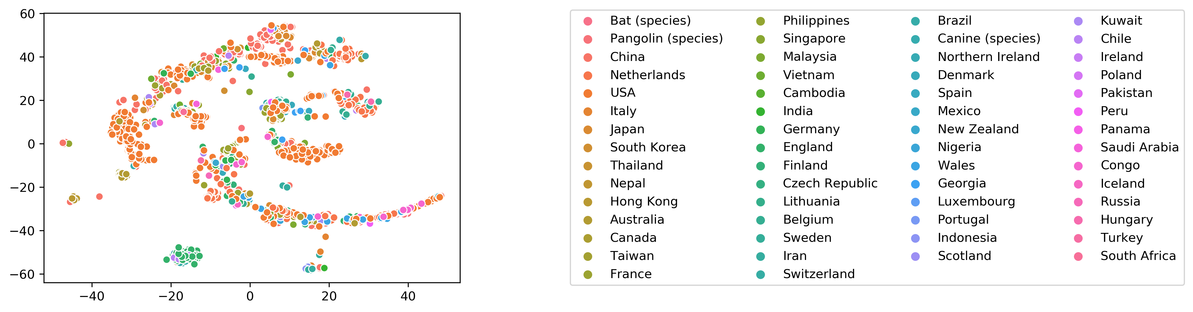
After converting the COVID-19 sequence to a 100-dimensional vector representation, we still need a way of visualizing it. Visualizing 100 dimensions is not possible so instead we use a dimensionality reduction technique called t-SNE. This technique is fairly popular and has a Python implementation in the package Scikit-Learn. We use this technique to reduce the 100 dimensions down to two so that the sequences can be plotted. The t-SNE technique attempts to preserve clustering in the data so sequences that are clustered in the higher dimensional representation should be close together in the visualization. There is some interesting clustering behavior in the visualization but it hard to draw any conclusions from it.
I thought this was an interesting small project that allowed me to work on some data visualization techniques. The results did not provide much insight into the mutations of COVID-19 but that wasn’t the goal of the project. Besides, the GISAID dashboard already has great visualizations of this data.